Ideas, inspiration and updates. Settle in and scroll through what’s new.
Latest posts
RiteKote Painting & Decorating
Painting tips
How about a black ceiling?
A black ceiling can work beautifully when the rest of the room brings balance.
In this kitchen, warm-white cabinetry, natural oak and plenty of daylight balance the dark ceiling. Black window frames and fittings tie the colour into the rest of the room.
It’s not for every room, but with the right balance it can look striking. Try a sample and check it in your room’s daylight and evening lighting before committing.
A black ceiling paired with warm whites and natural oak.
RiteKote Painting & Decorating
Painting tips
Touch-up—or repaint the whole wall?
A small wall mark doesn’t automatically mean repainting the room. Check the mark, find the original paint details and try a discreet test before deciding.
A quick dab of paint can leave a patch that attracts more attention than the original scuff. For an otherwise sound painted wall, here’s a practical way to choose the right fix.
Could the mark come off?
Check the paint manufacturer’s care instructions before cleaning. Try an approved method in a discreet spot first.
Avoid repeatedly scrubbing a stubborn mark. Rubbing can change the surface’s shine, so a shiny patch isn’t necessarily dirt that needs more cleaning.
Do you have the right paint?
Check the original product, colour and finish. Suitable leftover paint from the project can help, but even the original paint may leave a visible touch-up.
Application matters too. A brush dab can look different on a wall originally painted with a roller.
Try small, then assess
Start with a discreet trial rather than touching up every mark at once. Use a small amount and match the original application method where possible.
Allow it to dry according to the product’s instructions before judging the result or adding another coat.
When the whole wall makes sense
If the trial remains noticeably different, repainting the affected wall may give a more consistent appearance. That doesn’t automatically mean the entire room. A corner or another natural break can be a sensible stopping point.
The aim is the smallest appropriate solution, not simply the smallest painted patch.
A small mark is the starting point for assessing the finish. Illustrative room scene.
RiteKote Painting & Decorating
Colour & inspiration
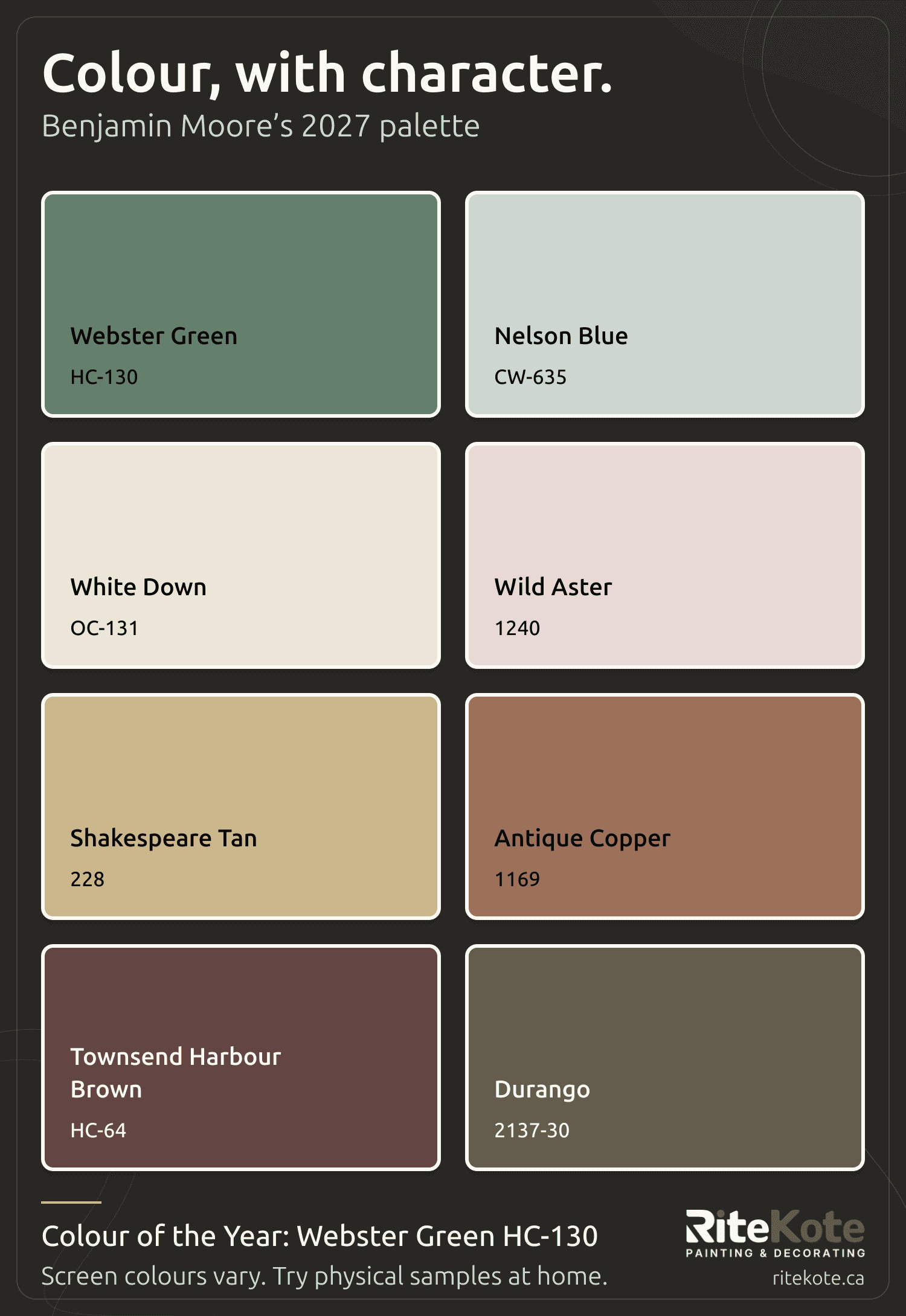
Benjamin Moore’s 2027 Colour of the Year & Colour Trends
Benjamin Moore has named Webster Green HC-130 its Colour of the Year for 2027, alongside a palette of seven more colours to explore.
Our take? Use the collection as inspiration, not a shopping list. You do not need eight colours, or a whole-home repaint, to find something that feels right.
Start with the one that catches your eye. Would you enjoy it across a room, or would a door or a smaller detail be enough? Then think about the flooring, furniture and finishes that are staying.
The full collection brings together Webster Green, Nelson Blue, White Down, Wild Aster, Shakespeare Tan, Antique Copper, Townsend Harbour Brown and Durango. There is room here for a quieter change or something with more personality.
Keep your shortlist small and try physical samples in your everyday lighting. The colour of the year is a conversation starter. The colour you live with should feel like yours.
Our own swatch layout using Benjamin Moore’s published digital palette. On-screen colours are approximations; confirm your choice with physical samples.
RiteKote Painting & Decorating
Colour & inspiration
Found your colour? Try it in your own room first.
You save a photo because the room feels just right. Before you commit to that paint colour, bring a sample into your own home.
Your flooring, furniture and everyday lighting are part of the picture too. A colour that feels warm and soft in one room may feel quite different in yours.
Keep your shortlist small. View samples beside your trim and the things you plan to keep, then look again at different times of day and with your lamps on. Give yourself a chance to see the room the way you actually use it.
You do not need to chase the colour everyone else is choosing. The best starting point is the feeling you want at home: calmer mornings, a brighter gathering space or a bedroom that helps you switch off.
A screen can give you inspiration. Your own room helps you make the decision.
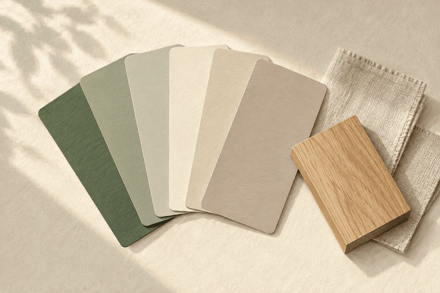
Illustrative colour and material samples for inspiration, not a completed RiteKote project.
Ready for a fresh look?
Tell us what you’d like painted. Let’s turn your plans into a clear, written estimate.